Project Profile 💼
In a snapshot:
- Time: Fall 2021 – Now
- Role: Lead UX Designer
- Team: 5 product managers, 3 UX designers, 2 UA Writers, 1 product owner, partnered development teams
- Design Methodology: Lean UX / Lean Canvas Board / Atomic Design
- Financial Impact: 7-figure increase in ARR
My main contributions:
- Lead new UX / UI with refreshed architecture to unify all fragmented parts together
- Create full documentation for every visual aspect and a process for QA/Engineering to align deliverables with HQ mockups and prototypes
- Build out WCAG 2.0-compliant design system
- Scope and plan transitional phases
Introduction & Background 📖
Frequence is a comprehensive advertising platform aimed at serving both small and medium-sized businesses (SMBs) and enterprise-level businesses. The platform offers a wide range of advertising solutions across various channels, including TV, radio, social media, search engine marketing (SEM), email, print, and custom options like billboards. This diverse set of channels allows users to reach their target audience effectively.
The platform’s versatility is emphasized by its ability to function as a white label solution, enabling thousands of partners to utilize it as their own, adapted to their specific branding and requirements. This growth and evolution have occurred over a decade, solidifying its position in the market.
Despite its success, Frequence faced a similar challenge to the LaCalle Group’s Continued brand in the EdTech verticals, which required a redesign of its existing design system. Frequence’s current user interface relies on basic, off-the-shelf Material UI components, which the company deemed inadequate for its future aspirations.
Fortunately, the application is built on Angular, similar to Webconnex, and this aspect streamlines the redesign process as it doesn’t necessitate significant backend modifications. To enhance its user experience and interface, the platform sought a redesign to replace its existing basic Material UI components while benefiting from the efficiency of its Angular-based backend.
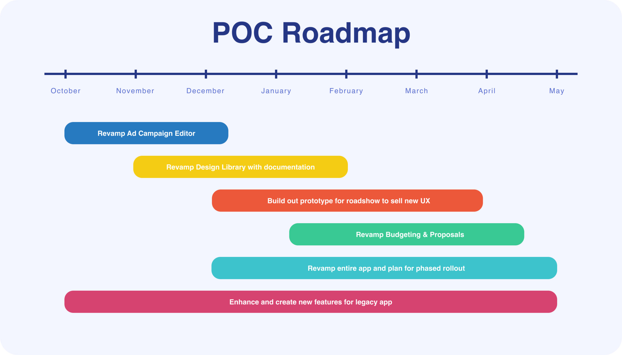
The Challenge 🧗
After accumulating a significant amount of engineering and design debt, the Executive Team members of Frequence directed their attention towards improving the user experience and addressing other areas of the application that required simplification and enhancement. To achieve these objectives, they decided to allocate additional resources to the task.
One of the primary steps taken was to expand the product team, enabling them to tackle the identified issues comprehensively. The team thoroughly examined the existing shortcomings and gaps in the app’s functionality. They also evaluated potential solutions for the app’s overhaul.
During this assessment, it became evident that the redesign process would be executed in multiple phases, and the implementation pace would vary accordingly. This acknowledgment was a result of recognizing the scale and complexity of the necessary improvements.
After several meetings, Frequence’s Executives recognized the existing challenges and committed to improving the user experience and other aspects of the app. They invested in additional resources by expanding the product team and planned to revamp the app in a step-by-step approach, understanding that the redesign would involve various phases with different levels of implementation speed.
Unifying Fragmented Experiences 📋
One of the key design patterns that needed overhauling was the incessant use of accordions, which went as far as three levels deep. To replace them, we used nested side drawers because they had following benefits over the existing design:
- Improved contextual design, when drilling down into sections (ie. the previous section becomes the background for the current section) and shortening the overall page length.
- More intuitive navigation assisted with the breadcrumb top navigation (ie. meta data in breadcrumb header allows the user to get better understanding of where he/she is working within the app).
- Increased scalability and flexibility as overlapping paneling will not affect the content’s width as nesting increases, in contrast to nested accordions.
- Consolidation and consistency with respect to modals and drawers will further usher in a modernized approach to SaaS app design.
In the above screenshot example, we can see two overlapping panels, which are accompanied by a breadcrumb navigation in the dark blue header bar. As the user drills down into each section, the breadcrumb will accommodate the section name and/or meta data.
A Minor Setback
Overall, while the product and engineering team loved this concept, it would later unfold that we had a hard limit on overlapping nested panels, which broke some of the earlier redesigns. We eventually settled on a combination of nested panels, single accordions and rail navigation tabs to clean up all the pages.
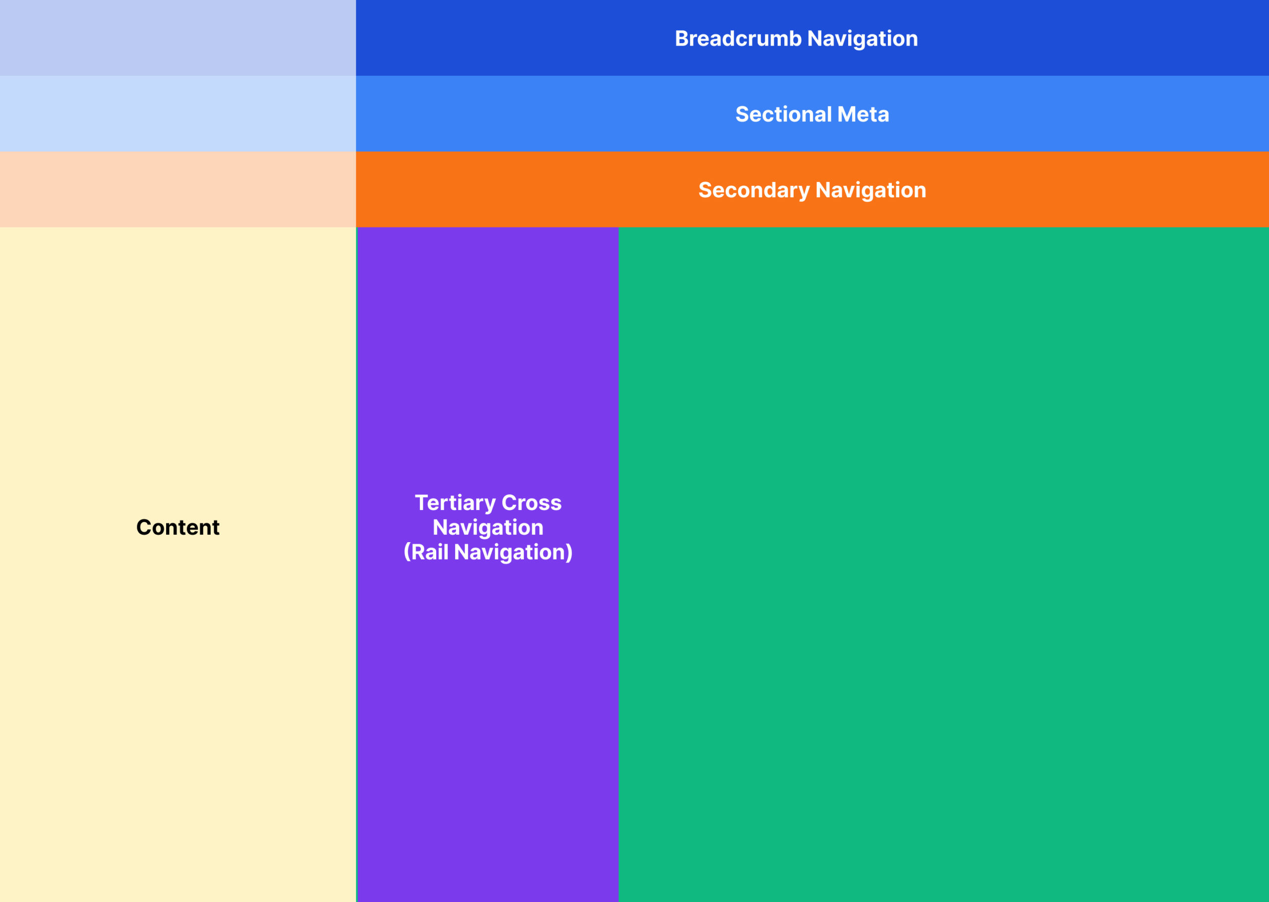
Providing Consistent Navigation
The main objective behind the development of the universal shell navigation in the context of pagination styles and date picker types inconsistencies was to establish a clear and coherent hierarchy for navigating between various pages and sections.
To achieve this, the design focused on defining a specific location and type of navigation to facilitate traversing across different pages and sections seamlessly.
- Primary and secondary navigation: These navigation elements were consistently positioned horizontally within the header, aligning with traditional layouts that users were already accustomed to.
- Tertiary cross-navigation: In addition to primary and secondary navigation, the concept of tertiary cross-navigation was introduced using panels. These panels played a crucial role in enhancing navigation options further. By incorporating this feature, users could navigate to related content and sections beyond the immediate primary and secondary levels.
- Within a section: Once a user accessed a specific section, vertical navigation bars were employed to enable easy cross-navigation within that section. These vertical navigation bars replaced the use of nested accordions and slide-outs, providing a more user-friendly and efficient experience.
Below is a diagram depicting the basic schematics of the proposed universal shell navigation:
Building Processes with Offshore Engineers
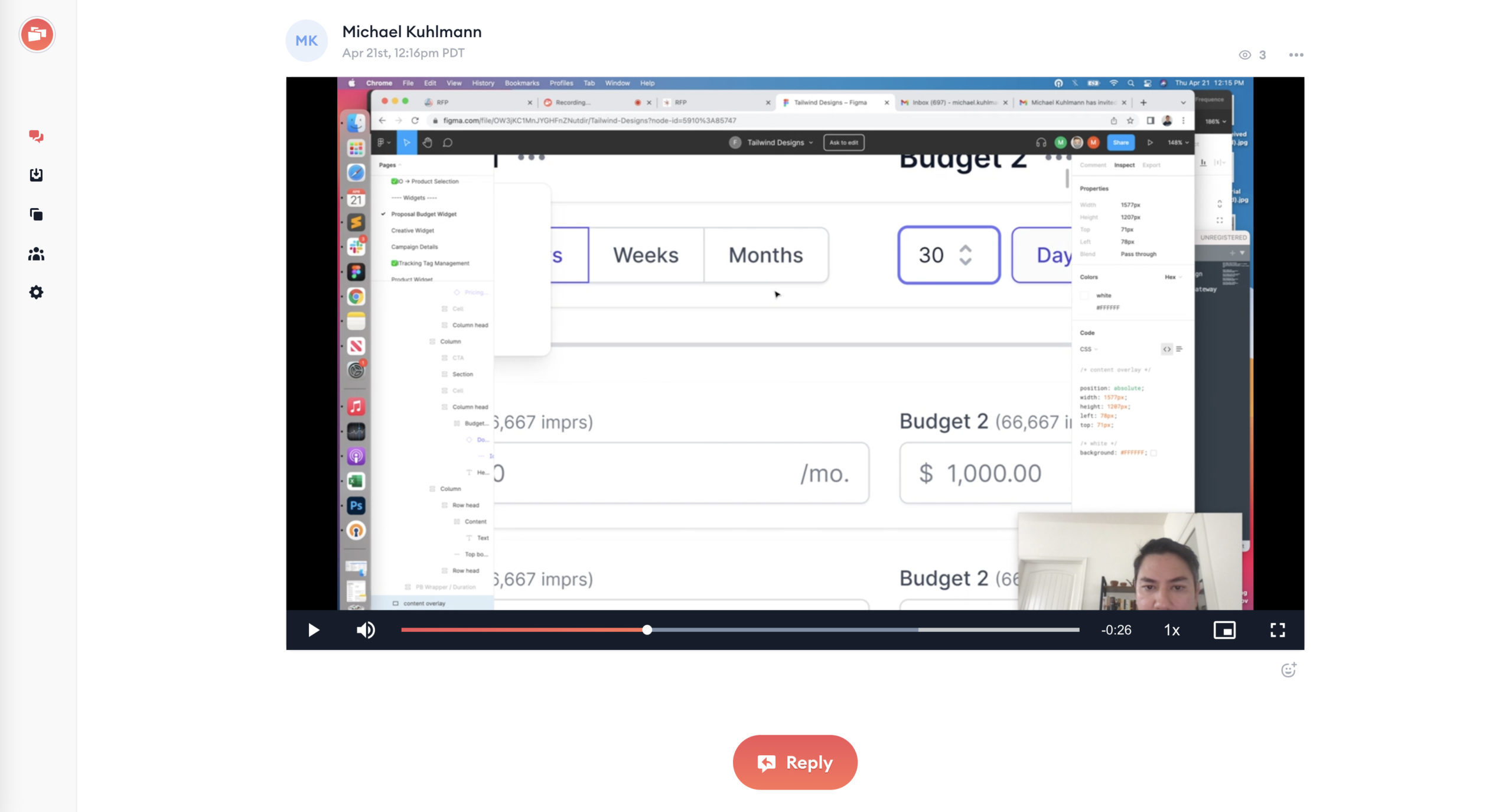
Due to the majority of Frequence’s headcount being in the engineering team based in India, it was essential to establish an effective method for maintaining synchronization with the iterative workflow involved in shipping new features and redesigns. Fortunately, I discovered a highly beneficial tool called ZipMessage at that time, which proved instrumental in facilitating communication and collaboration.
ZipMessage served as a screen recording tool that enabled me to streamline the process of providing feedback and edits to the engineers efficiently and promptly. Leveraging this tool, I could record multiple video messages, each focused on addressing specific enhancements or issues in a manner similar to the size of enhancement tickets.
Using the recorded video messages, I would elaborate on how to resolve visual inconsistencies or functional aspects in the product. This approach allowed me to communicate complex ideas and instructions effectively, ensuring the engineering team could comprehend and implement the necessary changes accurately.
ZipMessage was instrumental in enabling seamless communication between teams and bridging geographical gaps. By recording and sharing targeted video messages, I could efficiently convey feedback, edits, and instructions to the engineering team in India, aligning them with the iterative workflow and contributing to the successful shipping of new features and redesigns at Frequence.
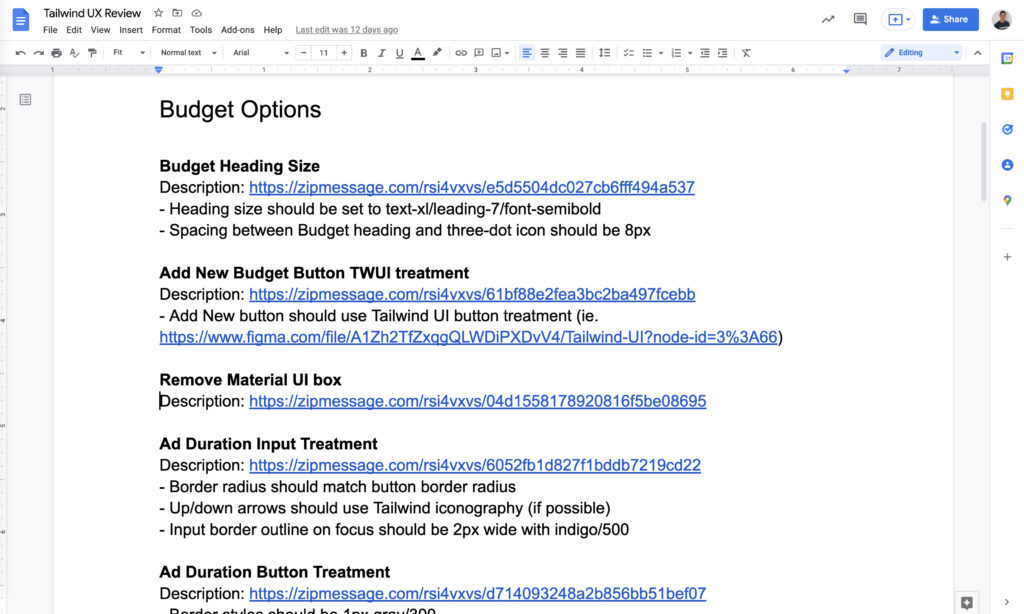
In addition to using ZipMessage to provide detailed feedback and edits to the engineering team, I would further consolidate all the recorded instructions into a Google Document. In this document, I included concise explanations on how to resolve the identified issues and inconsistencies found during the review process.
Subsequently, my product managers would take the compiled feedback and create individual tickets for each specific improvement or adjustment. This approach ensured that no issues were overlooked and helped prevent anything from slipping through the cracks during the development process.
By creating individual tickets for each enhancement or fix, the product managers ensured a systematic and organized approach to implementing changes, striving to achieve the closest possible alignment between the high-fidelity designs and the final coded counterparts of the product.
The Process ✍️
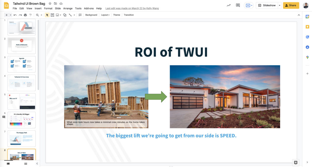
Before proceeding with the implementation of any new project, obtaining approval from the Executives was a crucial step. To gain their support, I presented a comprehensive outline detailing the project’s objectives and rationale. The presentation focused on two main aspects: leveraging an off-the-shelf design kit named Tailwind UI and the process used to align the UX with the engineering team.
- Tailwind UI Integration:
- To expedite the prototyping process, the team decided to adopt Tailwind UI, an off-the-shelf design kit known for its speed and efficiency in creating mockups and prototypes.
- By utilizing Tailwind UI, we aimed to accelerate the development cycle and ensure a seamless transition from design to implementation.
- Alignment of UX and Engineering:
- A key aspect of the project involved ensuring close collaboration and alignment between the UX and engineering teams.
- We emphasized the significance of a streamlined communication process between these two teams to ensure that the designs are accurately translated into functional code.
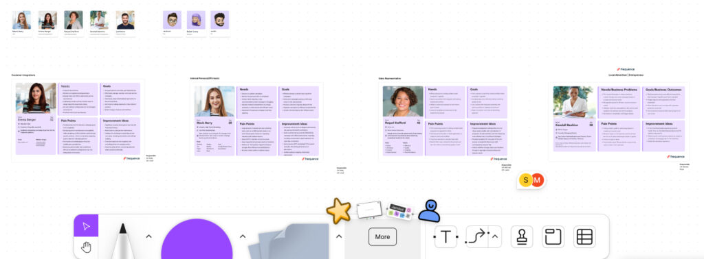
- We split up our workload into different personas, which was a welcomed change after divvying up the work by pod. We now insert each persona card into our design work to let the viewer know which part of the user journey is being impacted.

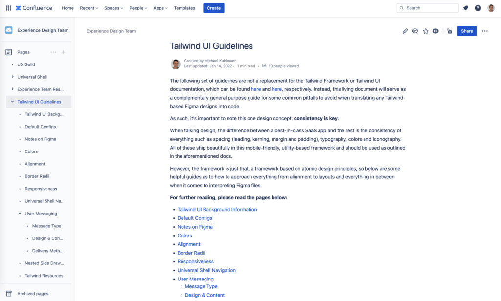
Furthermore, to facilitate the adoption of the Tailwind framework and maintain consistency across the codebase, I provided detailed documentation comprising nearly two dozen pages. This documentation covered various specifics of using the Tailwind framework and offered comprehensive instructions for the code implementation.
To address the existence of multiple versions progressing in parallel, I devised a systematic approach for the gradual conversion of Material UI to Tailwind UI. The process involved step-by-step transformations to ensure a smooth transition and maintain consistency across components. Here’s the formalized approach:
- Panel Conversion:
- The first step in the migration process was to focus on converting the Material UI component housed within the panel.
- This component was meticulously converted to its equivalent counterpart in Tailwind UI, ensuring that the functionality and design remained intact.
- Associate Parent Component:
- After successfully converting the panel, the next stage involved addressing the associated parent component.
- The parent component was updated and adapted to align with the Tailwind UI framework.
- “Tailwinding” the Content Wrapper:
- With the successful conversion of the panel and its parent component, the team proceeded to “Tailwind” the content wrapper.
- The content wrapper, being a crucial element in the layout, underwent necessary changes to conform to the Tailwind UI design principles.
- Final Chrome Conversion:
- The final step in the migration process encompassed “Tailwinding” the chrome, which constituted the main navigation and the page wrapper.
- The chrome transformation represented the last stage in the conversion process, ensuring that all major components were now using Tailwind UI.
By following this gradual approach, the team ensured a systematic and organized migration from Material UI to Tailwind UI. Each stage’s successful completion allowed the team to move on to the next, culminating in a fully “Tailwinded” interface across all levels of the application.
Data-Informed Decision-Making
During the complete process of overhauling the platform, I assumed the leadership role in the UX efforts, which included validating our design decisions through a series of user interviews. These interviews encompassed a wide range of users, representing diverse levels of usage and experience with the platform. Some users had been utilizing the platform for over four years, while others had only been using it for a year.
The user interviews served as a crucial mechanism for gathering feedback and insights directly from the platform’s user base. The overwhelming majority of the feedback received during these interviews indicated that our design decisions were headed in the right direction. The positive response from the users reinforced our confidence in the revamped design’s efficacy and user-friendliness.
As part of a phased approach, we have already implemented the new designs and rolled them out to a select group of users. However, to ensure a comprehensive evaluation and to capture feedback from a larger user base, we are currently awaiting additional feedback from a broader audience.
By gradually introducing the new designs in phases and gathering feedback from different user segments, we aim to gather valuable insights that will aid us in further refining and optimizing the platform’s user experience.
Results 💪
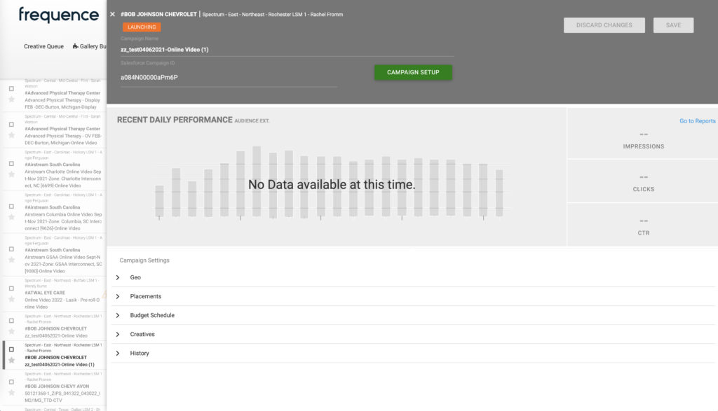
The proof-of-concept for introducing the new version of the platform resulted in several notable successes. First and foremost, the app’s navigation was significantly improved, presenting a polished and refined appearance. The user messaging saw significant enhancements, providing greater utility to the users. Additionally, the design patterns were made consistent across the platform, offering a cohesive and harmonized user experience. Moreover, the process of transitioning from one part of the app to another was remarkably simplified, leading to a smoother user journey in certain instances.
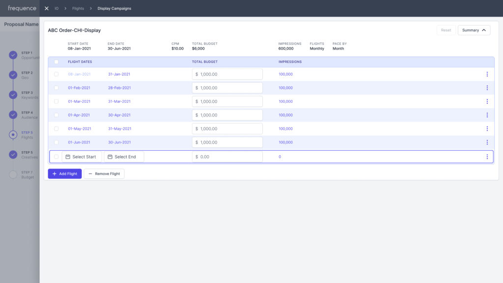
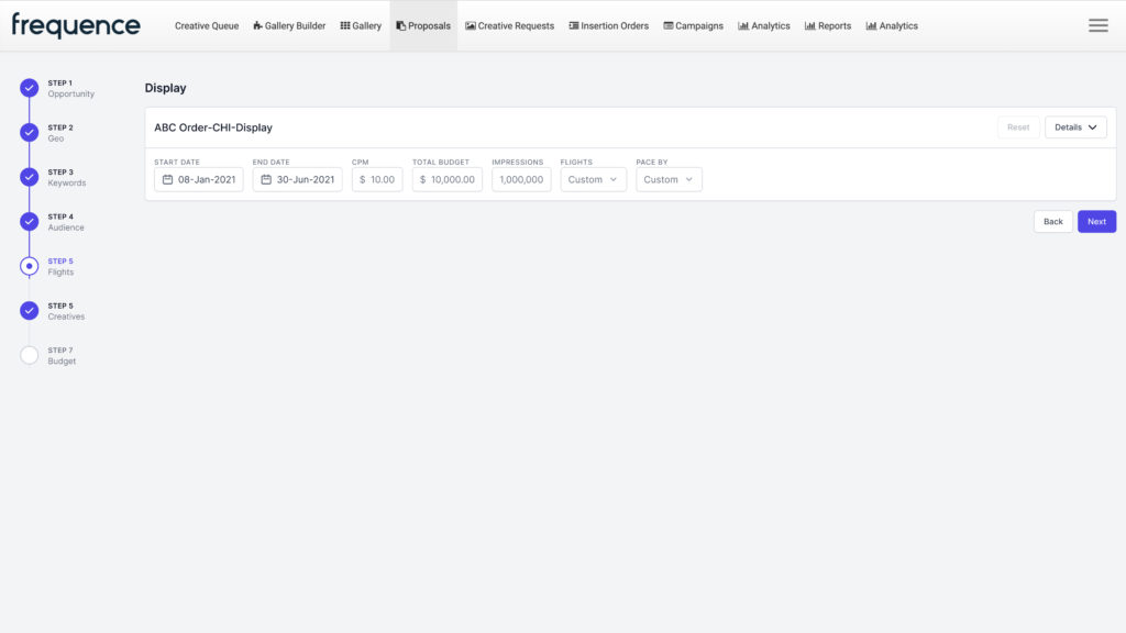
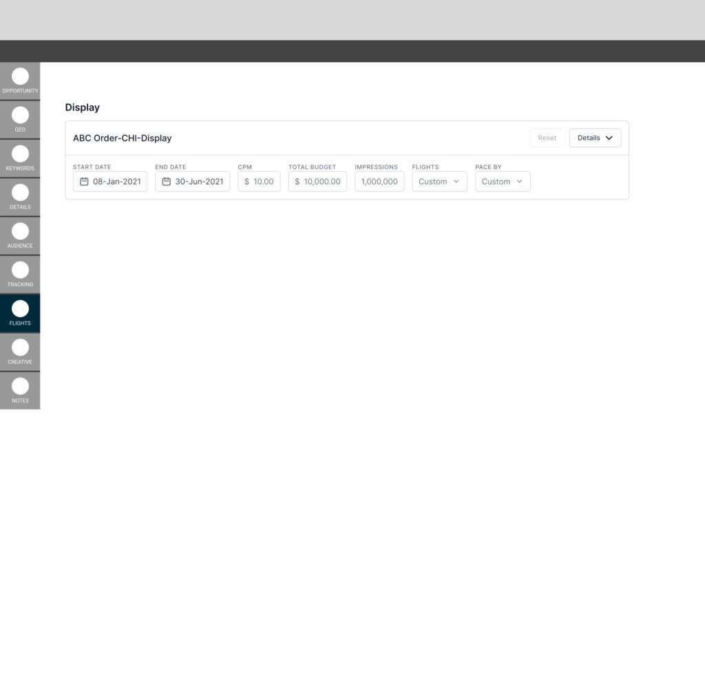
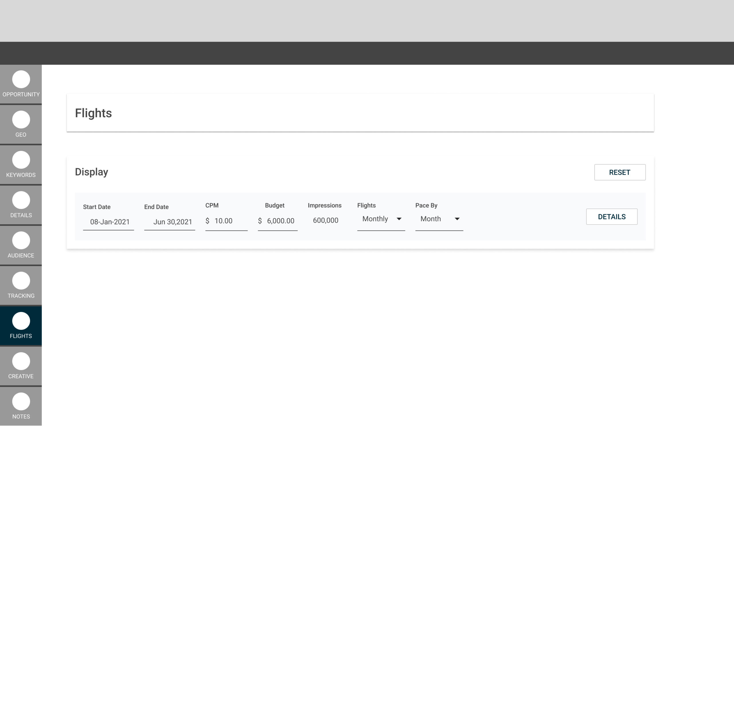
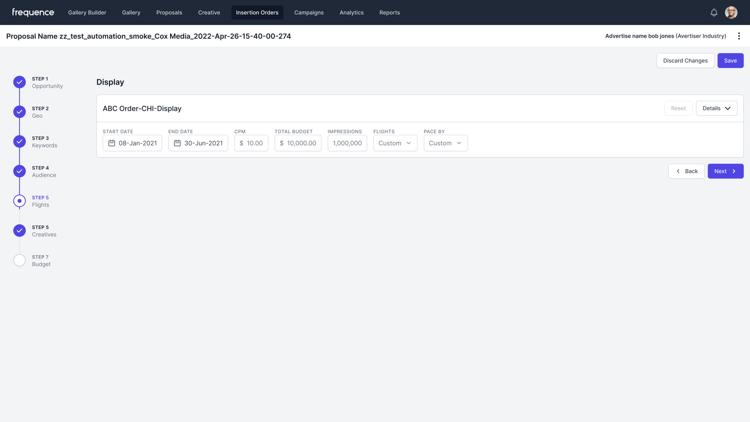
In the previous version of the platform, to edit the budget for a video campaign, users had to undergo a cumbersome process. They were required to endlessly scroll through a single page displaying all sections, then navigate through multiple clicks into the relevant section, the campaign, and finally, the actual budget section. This convoluted process resulted in a time-consuming and inefficient user experience.
In contrast, the new version of the platform significantly streamlined this process. Now, users can achieve the same task with just two clicks. The first click takes the user directly to the budget section, eliminating the need for extensive scrolling and navigating through multiple pages. With the second click, users can easily input all the relevant budget details. Notably, these details are then automatically spread across the video campaign’s runtime in the background, simplifying and expediting the overall process.
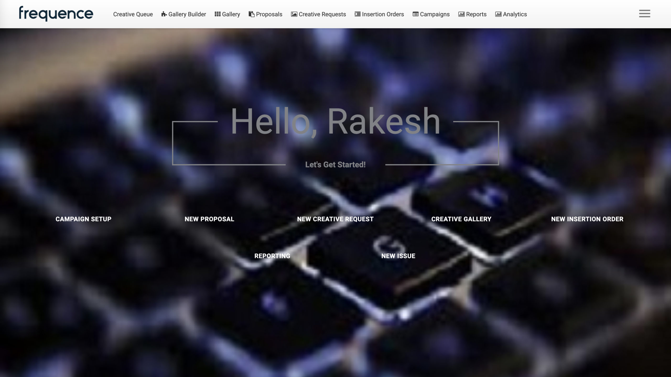
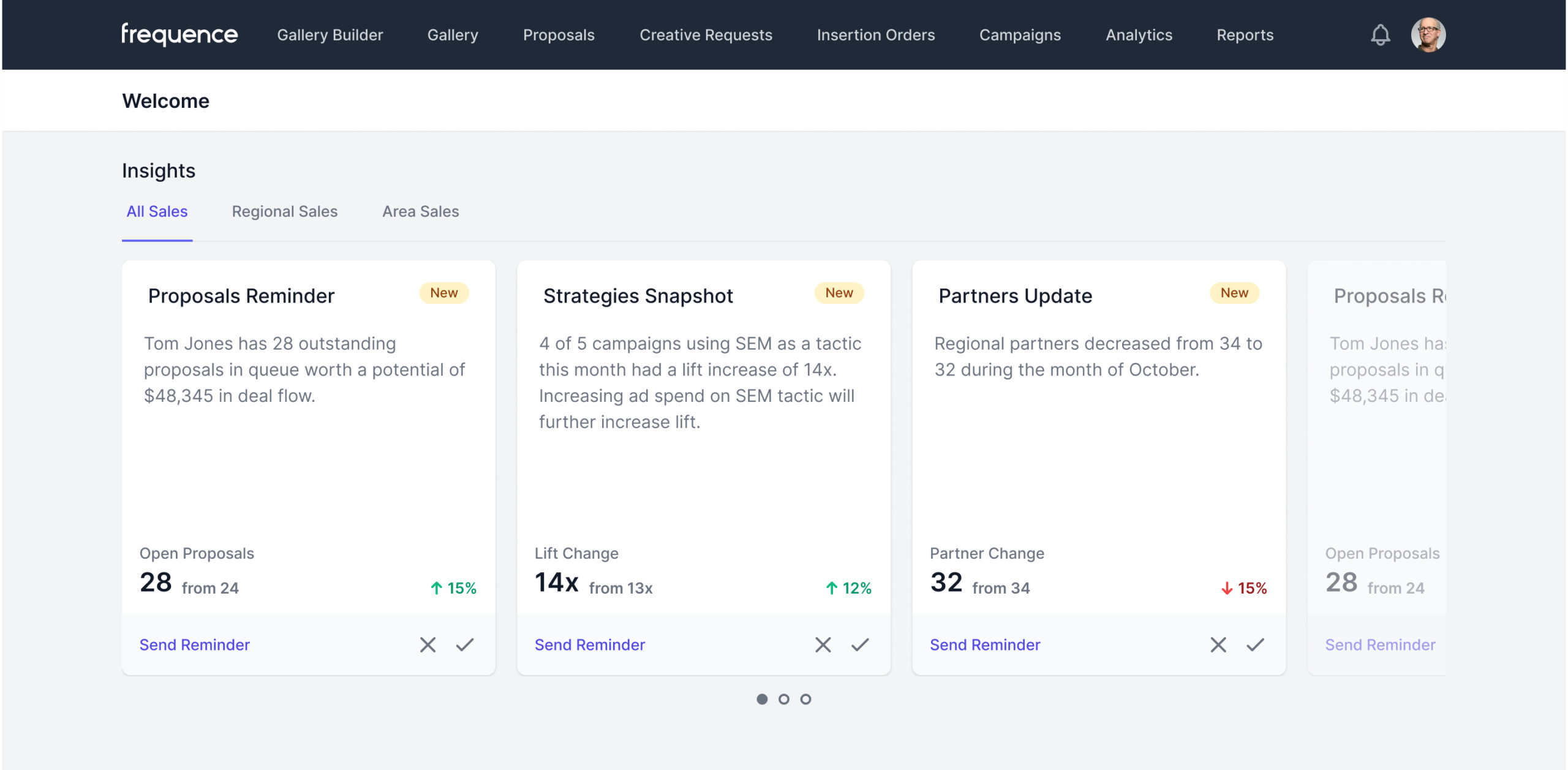
The subsequent major accomplishment was achieved through iterative screen design, specifically replacing the user’s outdated “welcome” page. The original page appeared quite sparse and dated, lacking the desired modern appeal. Leveraging Frequence’s extensive data resources accumulated over a decade, we conceptualized a new version centered around “Insight Cards.”
In the revamped version, the “Insight Cards” were strategically placed front and center on the page. These cards presented actionable information to the user, offering real-time updates on ongoing campaigns, advertisements, and other relevant data. By prioritizing the delivery of this crucial information at a glance, we aimed to eliminate the need for users to search and navigate across various app sections to gather essential data.
The approach involved “spoon-feeding” users with valuable insights, making it convenient for them to grasp the current state of their campaigns and advertising activities immediately upon accessing the platform. Our intention was to create a seamless user experience that not only simplifies data access but also empowers users to make informed decisions regarding their advertising expenditure.
By enhancing the “welcome” page with actionable “Insight Cards” and leveraging data-driven insights, we sought to cultivate user engagement and ensure their affinity towards our platform. Through this approach, we aimed to provide users with a deeper understanding of their data and empower them to optimize their advertising strategies effectively.
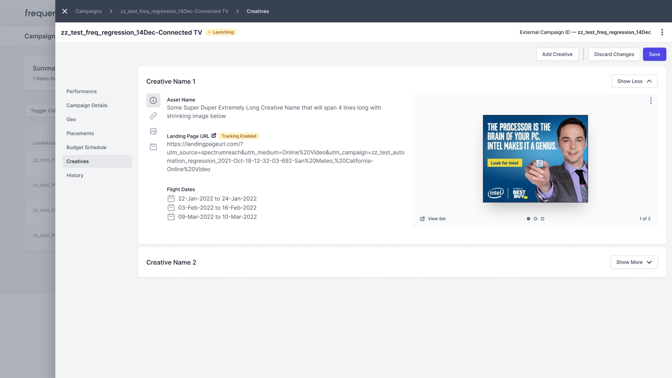
The last big-ticket item came in the shape of providing more structure to loosely defined spaces for components. Although a user could make sense of a campaign’s meta data, the way it was designed wasn’t really conducive to the average platform user. To put simply, some navigation had to be revamped and in certain parts had to be supplemented to provide a future-friendly way to support more elements onto a page section down the road.

A Short Story: Building A New Product
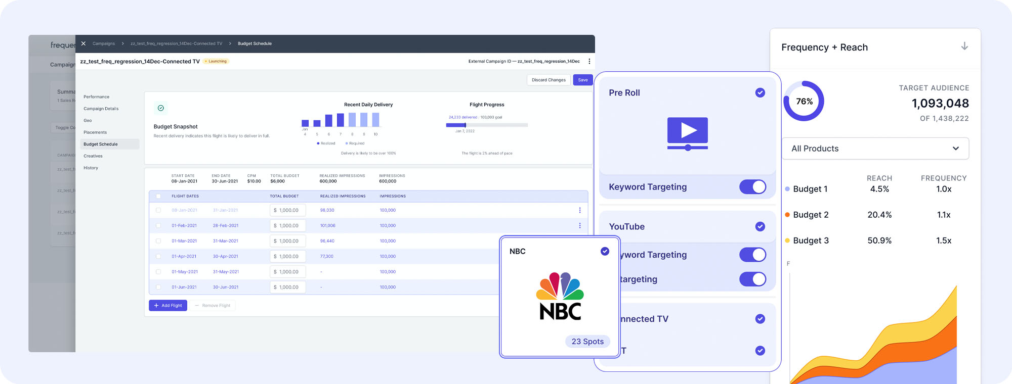
During the platform revamp, I assumed the responsibility of leading the vision and strategy for a new product feature called Unified Creative. This innovative feature addressed the issue of users having to perform redundant tasks when assigning demographical segments to ad products.
In the existing scenario, users faced the challenge of duplicating their efforts when selecting demographical segments for different ad products, such as Facebook and Twitter display products. With the introduction of Unified Creative, this tedious process was streamlined. Users only needed to perform the selection once, and the system automatically matched and applied the closest applicable user segments in the background. This streamlined approach was especially crucial since third-party integrations often resulted in mismatched demographic segments across various ad products, necessitating the use of a mapping tool.
I iterated on multiple approaches to develop the Unified Creative feature. Starting with a straightforward method, I gradually evolved it into a more powerful and sophisticated approach. The final version presented users with the opportunity to “upgrade” their ad performance through a quick and user-friendly three-step process:
- Select Demographical Segments:
- Users would begin by choosing their desired demographical segments for the ad product.
- Unified Creative Matching:
- In this step, the Unified Creative feature would automatically match and apply the most relevant user segments in the background. This ensured efficient and consistent audience targeting across different ad products.
- Performance Upgrade:
- Finally, users would be presented with the option to “upgrade” their ad performance. By adding more ad products through the Unified Creative feature, they could enhance the reach and effectiveness of their advertising campaigns.
The iterative design process allowed for refinement and optimization of the Unified Creative approach, resulting in a powerful solution that simplified users’ workflows and improved their ad performance.
The hi-fi end result below is slated to go into product of Q4 this year.