Project Profile 💼
In a snapshot:
- Time: Fall 2020 – Winter 2020
- Role: UX Designer
- Team: 1 frontend developer, partnered backend development teams
- Location: Remote
My main contributions:
- Ensure WCAG 2.0 contrast validation
- Ensure Submenu accessibility on mobile devices
- Prototype mobile menu to ensure proper design translation for development team members
Introduction & Background 📖
The LaCalle Group, with its collection of marketing sites for the LCMS (Learning Content Management System) SaaS app, utilized a modified version of Bootstrap 3.0 as the foundation for the design. While certain elements of the design, such as typography, color palette, and the incorporation of strong lines, were customized, other crucial aspects received less attention. Notably, the sites lacked compliance with WCAG 2.0 accessibility standards and relative ease of use in terms of page navigation.
The LCMS SaaS app’s marketing sites served as the primary touchpoints for potential users and clients. As such, ensuring an engaging, accessible, and user-friendly experience was of paramount importance. Unfortunately, the existing design framework, although customized in certain areas, fell short in critical aspects, leading to missed opportunities for optimal user engagement and satisfaction.
The lack of WCAG 2.0 accessibility compliance meant that the sites were not optimized for users with disabilities or impairments, which could result in exclusion and diminished user experience. Furthermore, the page navigation on the sites proved to be cumbersome, potentially impeding visitors’ ability to access information efficiently and navigate through the content seamlessly.
To address these limitations and enhance the user experience, a comprehensive redesign and reevaluation of the design framework were essential. The goal was to revamp the marketing sites, prioritizing accessibility, intuitive navigation, and improved user interaction. By adopting a more user-centric approach and adhering to best practices for design and accessibility, the LaCalle Group aimed to create a compelling and inclusive digital presence for its LCMS SaaS app.
The Challenge 🧗
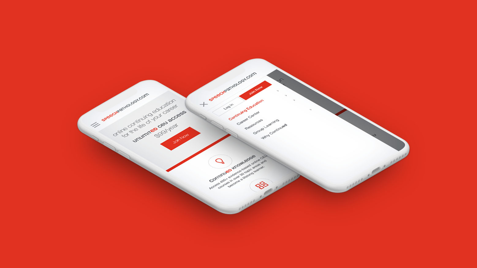
The LaCalle Group faced the challenge of revamping eight vertical marketing sites, all built on the same codebase using a modified version of Bootstrap 3.0. While the task of modifying the sites seemed straightforward, there were critical issues related to mobile navigation and submenu items that required careful attention.
One of the primary challenges was to revamp the mobile navigation to improve user experience and accessibility. The existing mobile navigation might have been functional, but it lacked the desired level of user-friendliness and efficiency. The LaCalle Group aimed to enhance the mobile navigation’s design and functionality to ensure seamless and intuitive access to the site’s content on smaller screens.
Additionally, the submenu items presented a user confusion issue. Although visually indicated as clickable, the submenu items were not functioning as expected, leading to potential user frustration and disorientation. Resolving this discrepancy was essential to align the visual cues with actual interactive elements, providing a more coherent and consistent user experience.
As all eight vertical sites shared the same codebase, modifying them collectively was a feasible task. However, it required meticulous attention to detail to ensure that each site’s revamp was consistent, user-centric, and addressed the specific challenges of mobile navigation and submenu items.
The challenge, therefore, lay in executing a comprehensive redesign that catered to the unique needs of each vertical site while adhering to a standardized design framework. By addressing the mobile navigation and submenu items’ issues, the LaCalle Group sought to create cohesive, user-friendly marketing sites that provided an optimal user experience across all verticals.
The Requirements 📋
The revamp of the LaCalle Group’s collection of marketing sites for the LCMS SaaS app involved addressing three critical items:
- WCAG 2.0 Contrast Validation: Ensuring that the sites complied with WCAG 2.0 accessibility standards was a key priority. Specifically, the focus was on validating contrast levels between text and background elements to improve readability for all users, including those with visual impairments.
- Submenu Accessibility on Mobile Devices: To enhance user experience on mobile devices, special attention was given to the accessibility of submenu items. The aim was to make the submenus clickable and intuitive, reducing user confusion and improving overall navigation.
- Streamlined Navigation Across All Sites: The existing navigation structure was optimized to provide a consistent and user-friendly experience across all eight vertical marketing sites. The goal was to create a seamless navigation flow that facilitated easy access to content and information.
The improvements to the mobile navigation played a crucial role in addressing these requirements. Instead of the traditional Bootstrap mobile navigation with a pull-down menu, a left-slideout menu layout was implemented. This layout was chosen to align with users’ familiarity when logged in, providing a more cohesive and intuitive experience for mobile users.
By streamlining the navigation and adopting the left-slideout menu approach, the LaCalle Group aimed to enhance user engagement, simplify content access, and improve overall usability across all marketing sites. Additionally, the focus on meeting WCAG 2.0 contrast standards and ensuring submenu accessibility on mobile devices contributed to creating an inclusive and user-friendly digital environment for all visitors.
To guarantee compliance with WCAG 2.0 accessibility standards, the design team took proactive measures during the revamp of the marketing sites for the LCMS SaaS app. One of the essential steps involved using the Contrast plugin for Figma, which facilitated testing the contrast ratio on all design elements.
Through the Contrast plugin, the team systematically evaluated the contrast levels between text and background elements, ensuring that they met the required accessibility guidelines. In particular, I focused on elements that utilized the red color, which needed adjustment to pass the contrast validation.
To address this, I increased the darkness of the red color, achieving a contrast ratio that met the WCAG 2.0 compliance requirements. By making this necessary adjustment, I ensured that the visual elements were easily discernible for users with visual impairments or other visual challenges.
This meticulous attention to contrast validation played a crucial role in creating a more inclusive and accessible design. By adhering to the WCAG 2.0 standards, the revamped marketing sites became more user-friendly and approachable for a broader range of users, regardless of their abilities.
The Process ✍️
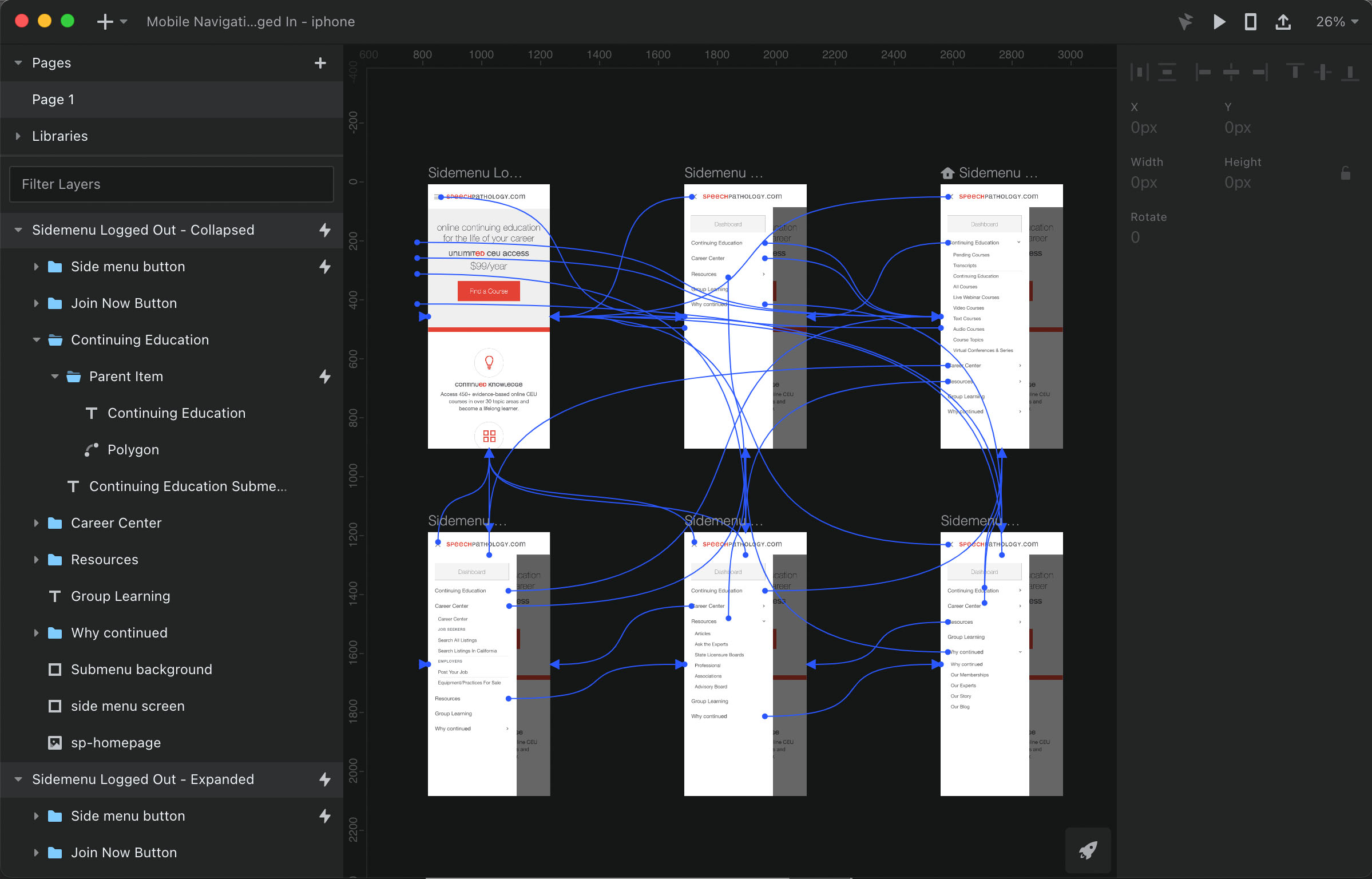
To seamlessly translate all visual elements, including animations, into production-ready code, a comprehensive process was adopted. The key aspect involved creating a prototype for the new mobile menu using InVision Studio, which emerged as the preferred tool over alternatives like Framer or Principle.
The decision to utilize InVision Studio was driven by practical considerations, as the team already had their existing projects housed in InVision. Additionally, the fact that InVision Studio was available as a free app further supported its selection as the preferred tool for this particular project.
The prototype served as a pivotal bridge between the design and development stages, ensuring that all aspects of the mobile menu were accurately represented and readily translatable into code. By using InVision Studio to create the prototype, the team could visualize and interact with the design elements in a more dynamic and lifelike manner, allowing for a comprehensive assessment of the user experience.
Throughout the process, the prototype underwent rigorous testing to validate its functionality, responsiveness, and overall user-friendliness. This iterative approach facilitated the identification and resolution of any potential issues or improvements before proceeding to the development phase.
The prototype served as a vital reference point for the development team, providing clear guidance on the desired user interactions, animations, and visual effects. This synergy between design and development significantly streamlined the implementation process and reduced the likelihood of misinterpretations or deviations from the original design vision.

Results 💪
The implementation of the updated mobile menu yielded significant improvements in both user navigation and visual appeal across all marketing sites for the LCMS SaaS app. The revamped mobile menu proved to be highly effective in assisting users in seamlessly navigating throughout the sites, enhancing their overall browsing experience.
The enhanced mobile menu design was optimized for intuitive interactions, ensuring that users could access information effortlessly, regardless of their device’s screen size. By adopting the left-slideout menu layout, users could easily access submenu items, eliminating confusion and providing a more coherent navigation flow.
Moreover, the visual enhancements of the mobile menu contributed to a more attractive and engaging user interface. The design’s visual appeal captured users’ attention and encouraged them to explore further, driving higher engagement rates.
A notable outcome of the improved mobile menu was the substantial increase in pageviews to second-level pages of the sites. The streamlined navigation encouraged users to delve deeper into the content, exploring additional sections and features of the marketing sites.
With the new mobile menu in place, users experienced a more seamless and intuitive browsing journey, resulting in improved satisfaction and increased user retention rates. The enhanced user experience positively impacted the sites’ metrics, leading to a boost in engagement and overall site performance. The successful implementation of the revamped mobile menu contributed to a more user-centric and effective digital presence for the LCMS SaaS app’s marketing sites, further solidifying the LaCalle Group’s commitment to providing an exceptional user experience.