Project Profile 💼
In a snapshot:
- Time: Winter 2021 – Summer 2021
- Role: UX Designer
- Team: 1 Lead UX designer, 1 product manager, partnered development teams
- Design Methodology: Minimum Viable Product / Atomic Design
- Financial Impact: 5-figure increase in MRR
My main contributions:
- Build critical MVPs with product & tech
- Develop UX involvement in product planning
- Evolve WCAG 2.0-compliant atomic-based design system
- Research and explore new dashboard ideas to simplify administrative tasks
Introduction & Background 📖
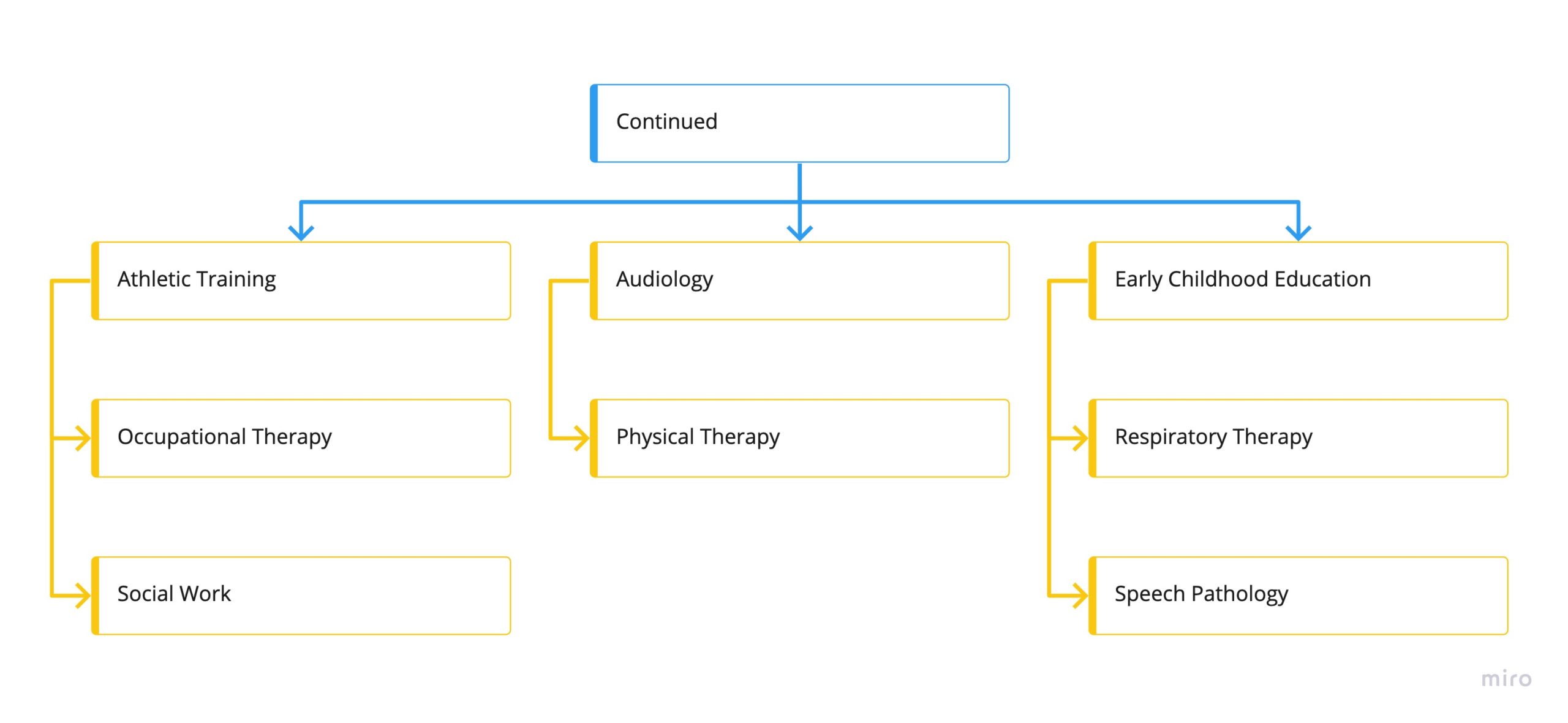
The LaCalle Group, specifically its Continued brand dedicated to EdTech verticals, recognized the necessity for a comprehensive design system. This realization came as part of their ambitious plan to overhaul the existing legacy platform and transform it into a more refined and modern Software as a Service (SaaS) application.
The legacy platform predominantly relied on technologies such as CakePHP and jQuery. In order to validate the feasibility and potential of the proposed revamp, a proof-of-concept was undertaken. For this purpose, a combination of cutting-edge technologies was selected, including Vue.js with Vuetify and Nuxt.
Vue.js, a progressive JavaScript framework, was chosen to bring interactivity and flexibility to the user interface. Vuetify, as a UI component library, supplemented Vue.js by offering a wide array of pre-designed components, streamlining the development process and ensuring consistency in the user interface. Nuxt, a framework for server-side rendering and static site generation, complemented the stack, enhancing performance and search engine optimization.
By employing this tech stack in the proof-of-concept, the LaCalle Group’s Continued brand aimed to validate the practicality and potential of transitioning to a more polished and contemporary SaaS application. The integration of Vue.js with Vuetify and Nuxt demonstrated the ability to modernize the platform while preserving the efficiency of the existing technology stack.
The Challenge 🧗
The primary challenge faced during the revamping process was to streamline every visual aspect of the application. This necessitated a shift away from the traditional Photoshop/Illustrator design stack towards more efficient and collaborative tools like Figma and InVision.
However, the redesign was not intended to be a mere visual facelift with a new UI kit. Instead, the focus was on a complete overhaul of the design system, adopting a modular approach known as atomic design. This strategic decision aimed to revolutionize the way design was conceptualized and implemented, enabling scalable design efforts across the application.
By adopting atomic design principles, the design system was restructured into distinct and reusable components. This modular approach provided several advantages. Firstly, it empowered the design team to create and maintain a library of components that could be easily reused across the application, promoting consistency and efficiency. Secondly, it allowed the development teams to benefit from a lower technical lift when coding new features, as they could leverage the modular components seamlessly.
In essence, the challenge was twofold: to transition from traditional design tools to more collaborative ones and to embrace atomic design principles for scalability and efficiency. By successfully tackling this challenge, the team aimed to achieve a streamlined, cohesive, and scalable design system that seamlessly integrated with the development process.
The Requirements 📋
Given that Continued’s EdTech offerings operate within the education sector, it was imperative for the design system to adhere to the WCAG 2.0 standard. Compliance with this standard ensured accessibility for all users, particularly those with visual impairments or other disabilities. The design system was specifically crafted to accommodate people with visual deficiencies, enabling an inclusive and user-friendly experience for a diverse audience.
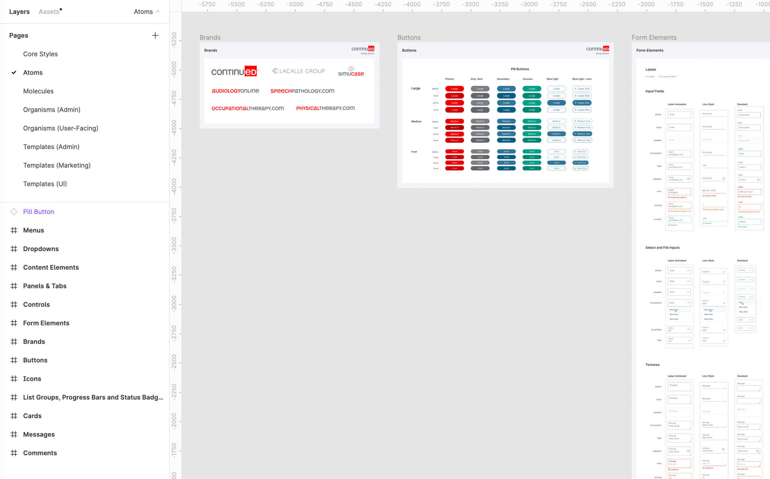
Furthermore, the transition from conventional design to atomic design marked a significant shift in the approach. The emphasis shifted from creating one-off designs to adopting a modular component-based methodology. The essence of atomic design lies in organizing elements into atoms, molecules, and organisms, forming a cohesive and scalable system. This new approach guided the frontend development team, encouraging them to think in terms of modular components rather than isolated designs.
The overarching goal was to streamline the design and development process via the design system’s focus on creating atoms, molecules, and organisms, which facilitated reusability and consistency, ensuring seamless integration across the application’s frontend. This systematic and organized thinking pattern paved the way for a more efficient, maintainable, and flexible development process.
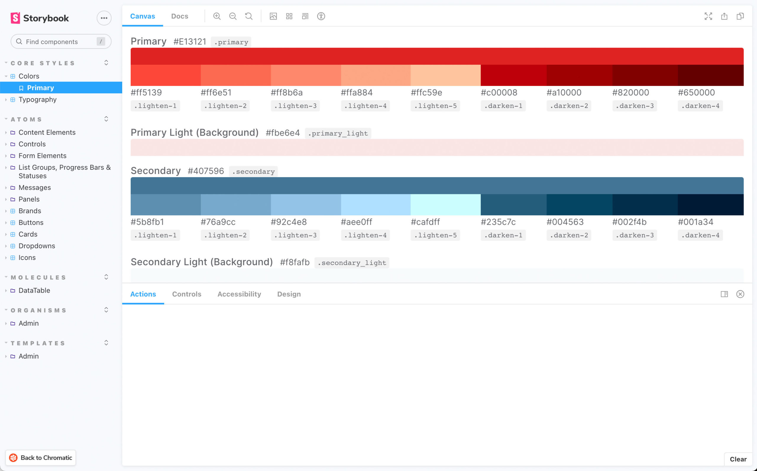
To guarantee compliance with WCAG 2.0 accessibility standards, our design and development teams implemented specific measures. In the design phase, we utilized the Contrast plugin for Figma extensively to evaluate the contrast ratio of all elements. This plugin enabled us to assess the color combinations used within the designs, ensuring they met the required accessibility guidelines, especially for users with visual impairments.
Additionally, the Frontend team took a proactive approach by integrating accessibility testing into their Continuous Integration/Continuous Deployment (CI/CD) workflow. By incorporating accessibility testing as an integral part of the development process, they could identify and address any potential accessibility issues at an early stage. This approach minimized the risk of overlooking accessibility considerations and ensured that the final product adhered to WCAG 2.0 standards.
The Process ✍️
To ensure full compliance with WCAG 2.0 accessibility standards, our design and development teams implemented comprehensive measures. During the design phase, we made extensive use of the Contrast plugin for Figma, which allowed us to evaluate the contrast ratio of all elements. This plugin played a crucial role in assessing the color combinations utilized in the designs, ensuring they met the required accessibility guidelines, particularly for users with visual impairments. By meticulously examining the contrast ratios, we ensured that the visual elements within the designs were easily distinguishable, facilitating optimal readability and usability for all users.
Furthermore, the Frontend team proactively addressed accessibility concerns by integrating accessibility testing directly into their Continuous Integration/Continuous Deployment (CI/CD) workflow. By seamlessly incorporating accessibility testing into the development process, they could promptly detect and rectify any potential accessibility issues at an early stage of development. This proactive approach significantly reduced the risk of oversight and ensured that accessibility considerations were ingrained throughout the entire development lifecycle. As a result, the final product met the stringent WCAG 2.0 standards, guaranteeing an inclusive and accessible user experience for all users.
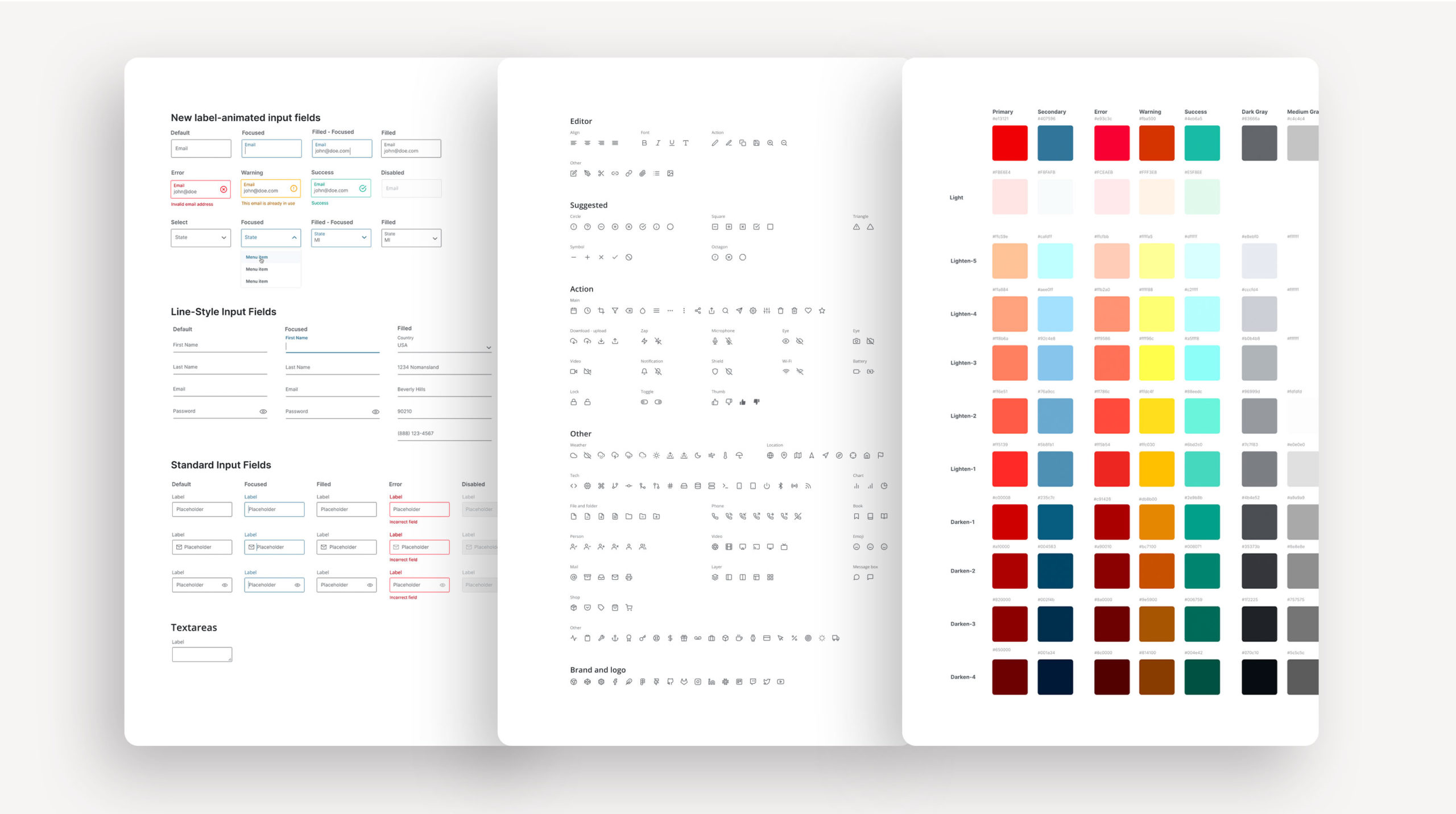
To put that into perspective, we have about 50-60 components in our library with many of them having many variations.
Results 💪
The implementation of our design system yielded remarkable outcomes, significantly enhancing our prototyping and development processes. The design system enabled us to achieve an impressive increase in prototyping velocity by over 40%, allowing us to iterate and explore ideas more efficiently. Moreover, our development velocity saw a commendable growth of 20%, streamlining the coding process while ensuring adherence to compliance standards and maintaining aesthetic consistency.
The introduction of the design system proved to be a game-changer in our workflow. By leading the charge in creating this system, I was able to produce dozens of high-fidelity prototypes with relative ease, benefiting from the reusability and consistency offered by the modular components. This efficiency in creating high-fidelity prototypes empowered us to communicate ideas effectively, collaborate seamlessly with stakeholders, and validate concepts swiftly.
These results exemplify the effectiveness and impact of a well-crafted design system. The streamlined prototyping and development processes allowed us to work more productively while ensuring that all design aspects remained compliant and visually harmonious. Our ability to create numerous high-fidelity prototypes with ease further demonstrated the success of the design system in supporting a smooth and efficient design workflow.
The implementation of our design system, essentially, led to significant improvements in prototyping and development velocity, resulting in a 40% increase in prototyping speed and a 20% boost in development speed. The system’s adoption allowed us to maintain compliance and aesthetic consistency effortlessly. As a result of leading the development of this system, I successfully produced numerous high-fidelity prototypes with ease, showcasing the positive impact of the design system on our productivity and design quality.
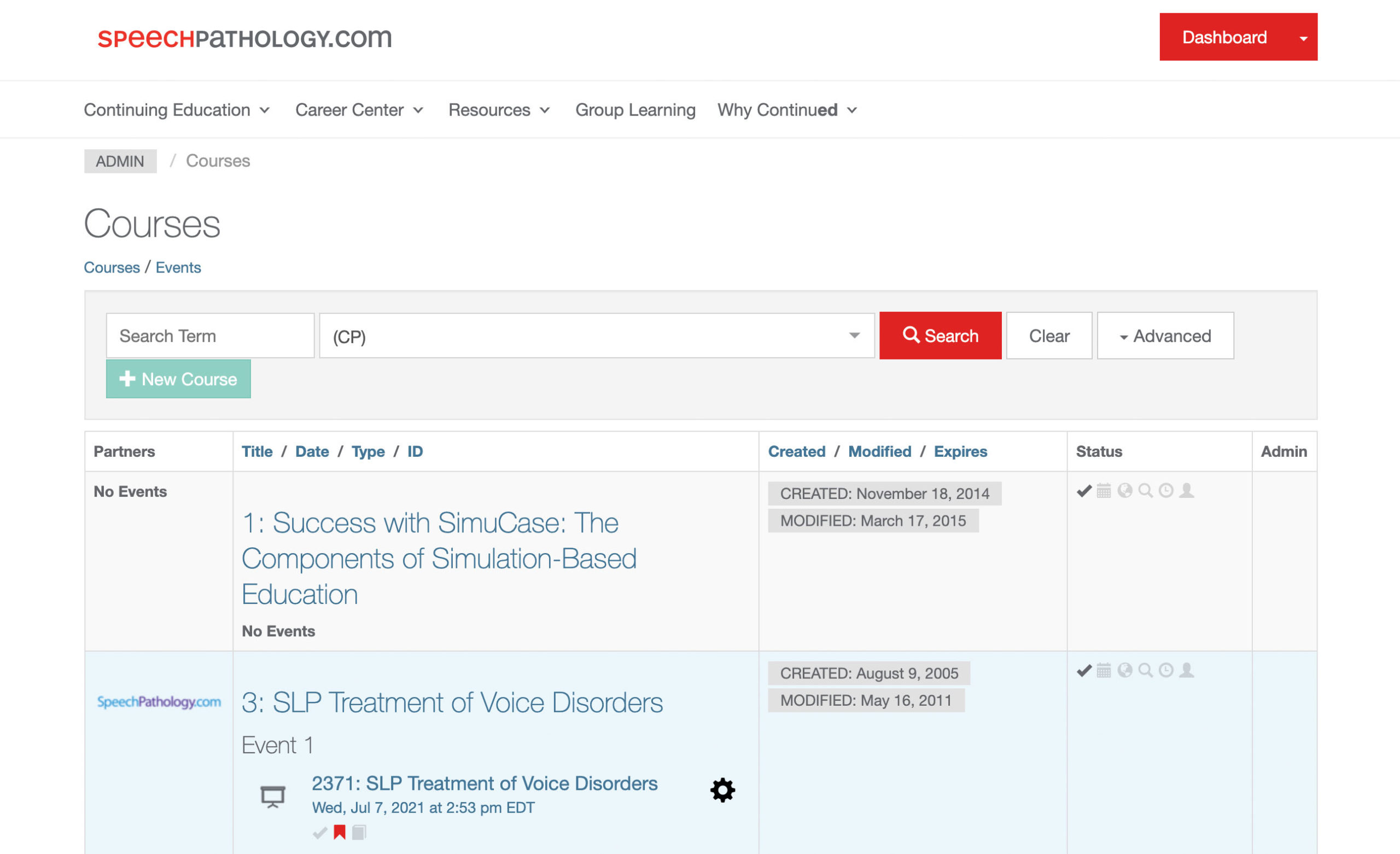
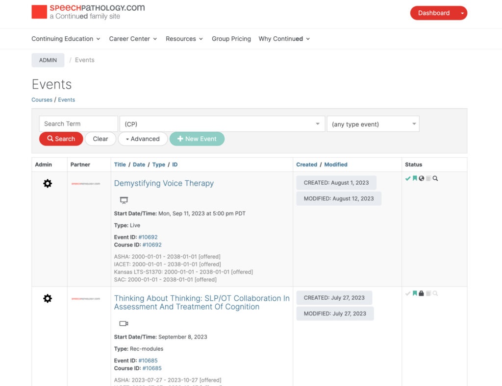
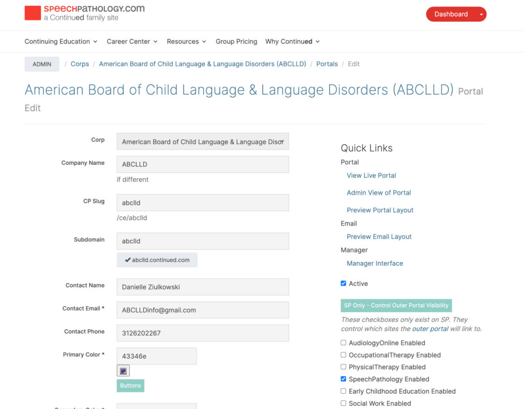
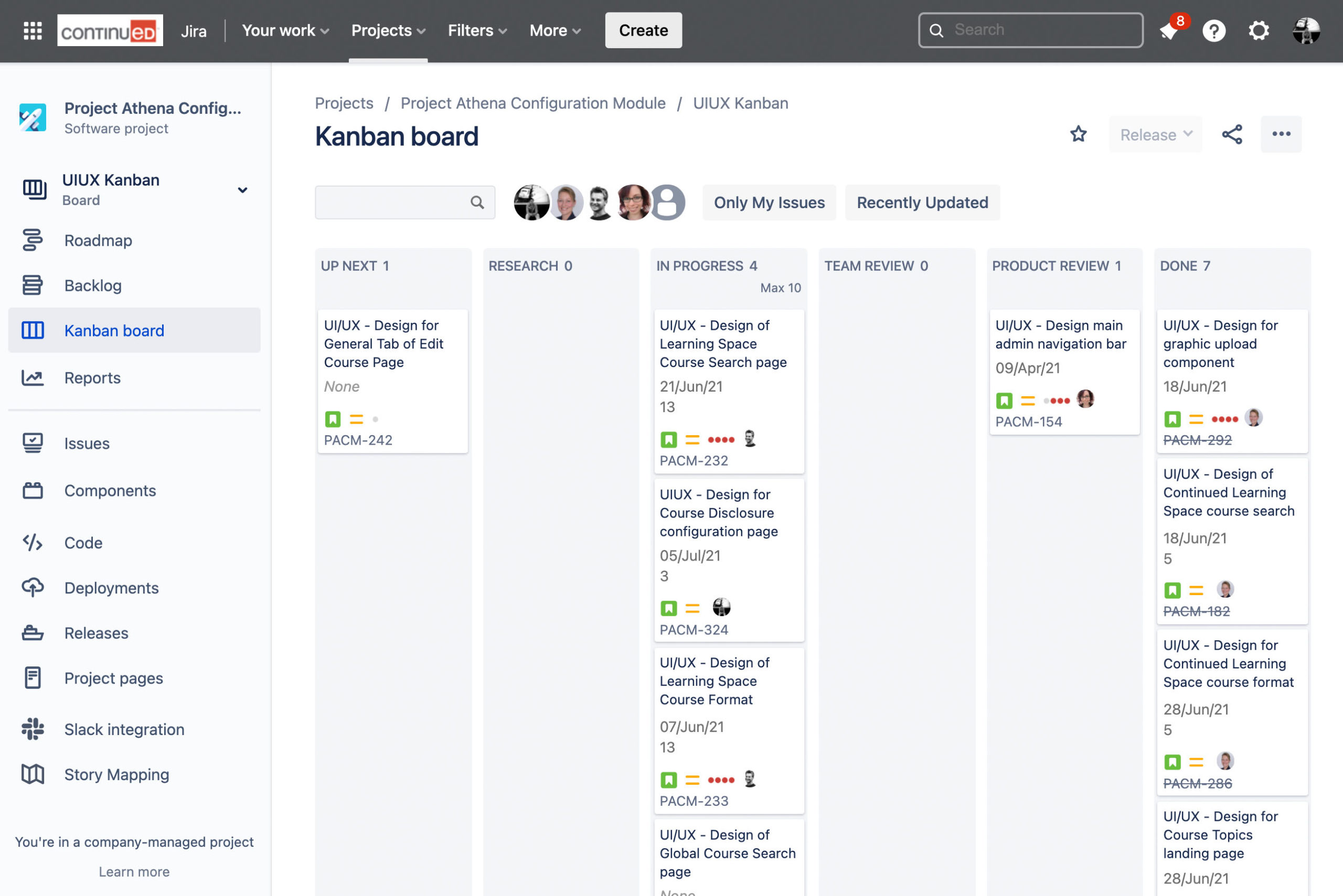
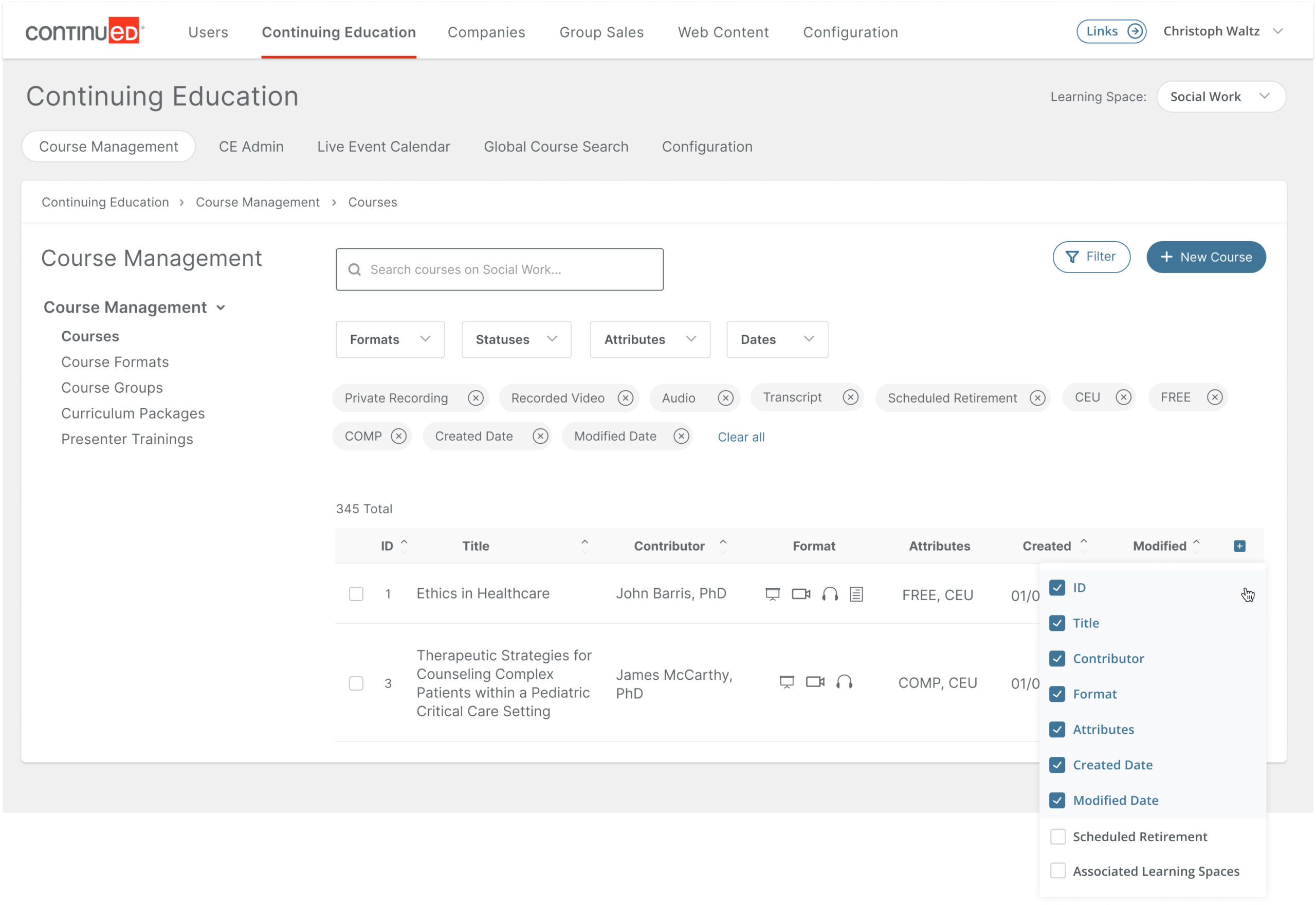
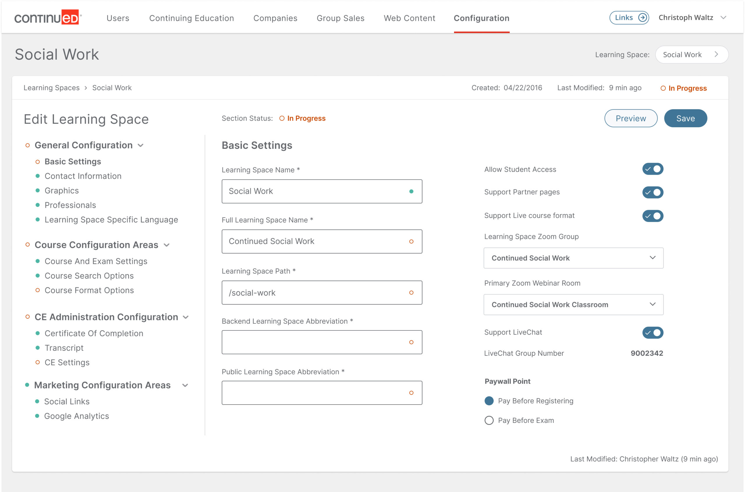
Here are some examples of the high-fidelity prototypes created:

Additional Notes 📝
The previous system was designed with a custom themed version of Bootstrap, so for additional context, here’s a screenshot of what that dated version used to look like.